Spotlight on Gold Coast Penthouse “A Family Legacy”
It’s not everyday when one has the opportunity to be featured on the cover of Interiors magazine. Susan Brunstrum, Principal of Studio Brunstrum, reflects on her latest January cover. Studio Brunstrum’s Gold Coast penthouse renovation entitled, “A Family Legacy,” is filled with history and creativity. As we go Behind the Design with Susan Brunstrum, uncover how Studio Brunstrum aesthetically incorporates design elements from the past to create a home for generations to come.

What design inspirations were used for “ A Family Legacy” project?
The wife fell in love with many of the 1940’s design inspiration images we used to begin a dialogue and conversation. Very “Hollywood-esque”, the images included a chandelier and a detailed ceiling design. We created a custom update for the ceilings in the living room and dining room and designed our first ever custom chandelier for the foyer. The same paint color, a light blue/gray was used throughout the home for continuity, acquiescing to the client’s request that the interiors didn’t overshadow the remarkable views outside. The particular shade was one the wife found in a magazine and served as the foundation for the balance of the calming and serene furnishings we created, giving the family an escape from the chaos of Michigan Avenue below. The design and architectural plans focused on functionality and adaptability; it was important to not solely focus on the needs of the present, but also for the future needs of this family of five. We wanted to acknowledge and honor the emotion behind the transition from generation to generation, letting the story of the family become the focus of the home.
Did you and your team experience any challenges? If so, how did you overcome them?
The homeowners had four requests for the design of the space: the parquet flooring in what was the father’s office had to be used somewhere within the space, the condo needed to feel more cultivated and “city”-esque than their traditional home in the suburbs, the bunk room was to be nautical themed for their sons, and the colors should complement the changing blues of the Lake Michigan views out their windows.
To prioritize function, perfecting the architectural plans to fit the dual needs of the family was the first step in the renovation project. The key was to use every square inch of existing space to change the flow of the unit, while simultaneously giving it the more upscale, yet inviting feel the couple wanted. The existing living room was then split into areas for both the living room and dining room, leaving space to widen the foyer and expose the exquisite NE facing views of Lake Michigan upon entering the condo.
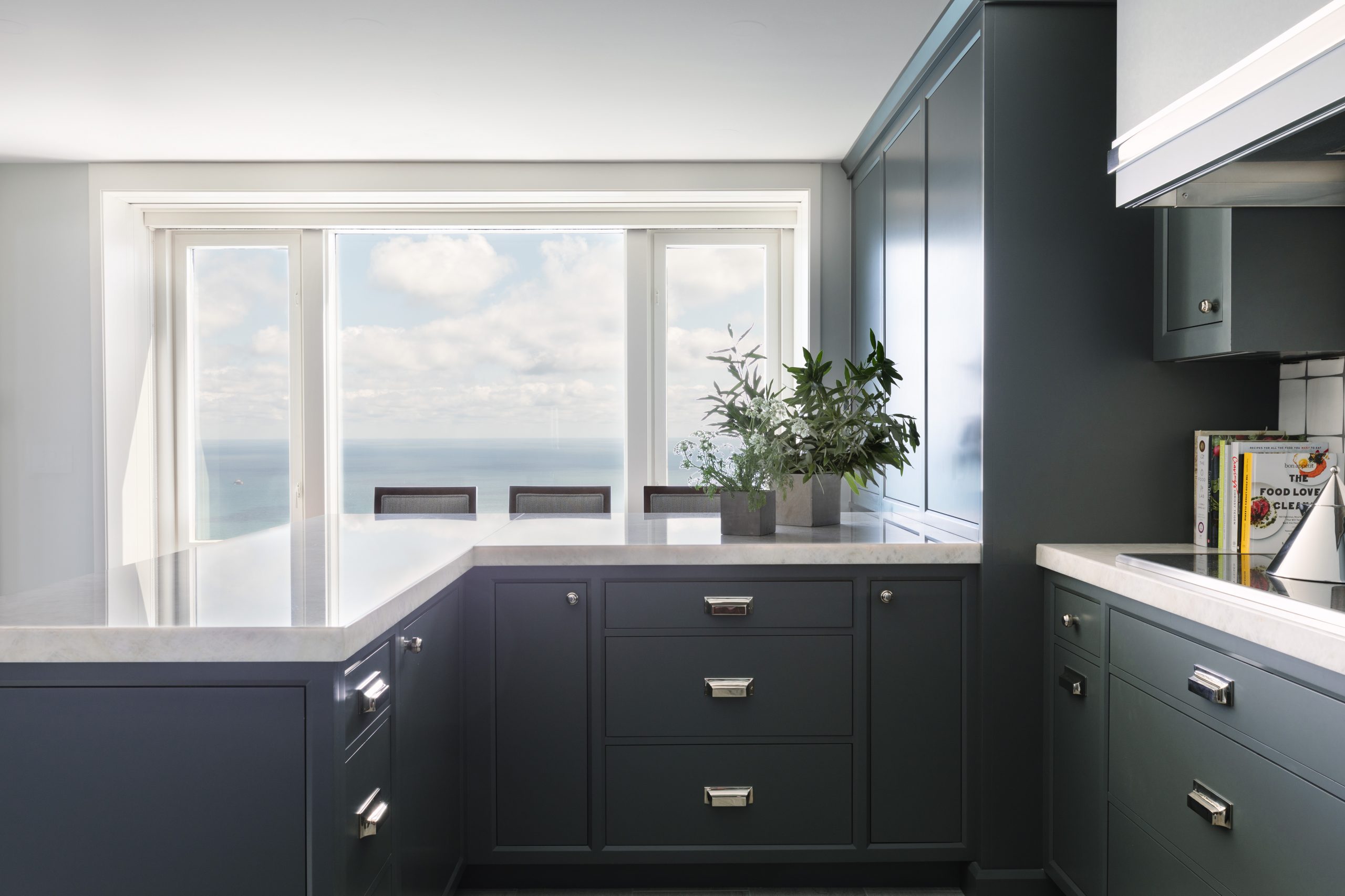
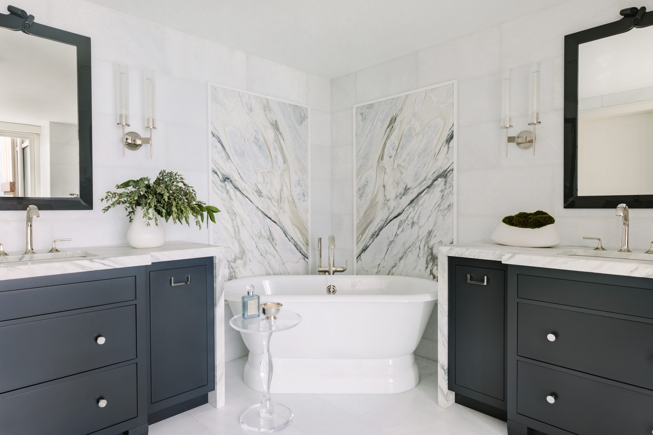
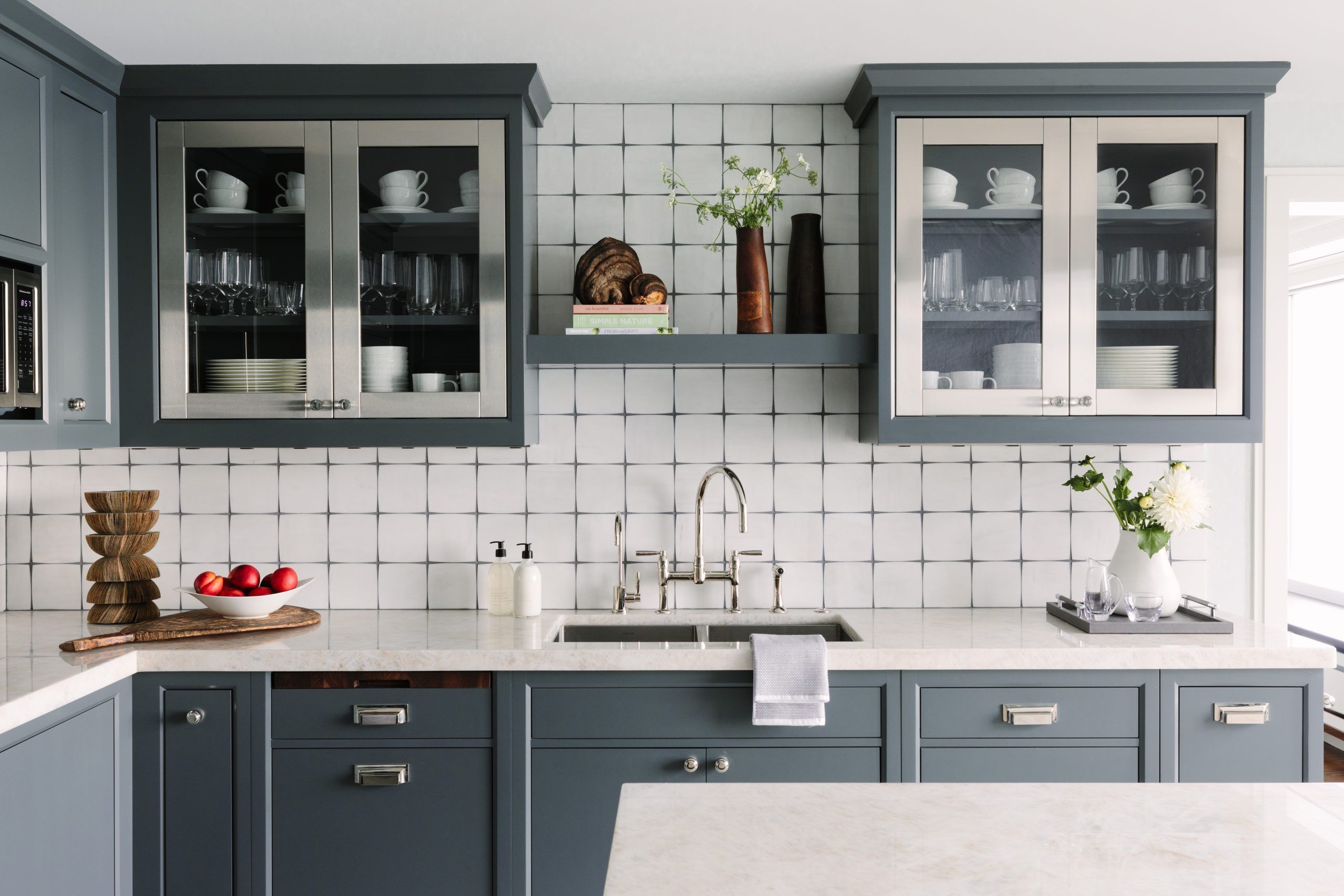
The office was enlarged slightly to become a bunk room, accommodating four custom-built bunk beds of our design. The en suite master bedroom and bathroom were completely renovated to mimic the aesthetic of a luxurious hotel room, re-configuring the closet and master bathroom to accommodate enlarged vanities and an enclosed, custom steam shower for the couple to enjoy with views of Lake Michigan. The kitchen was designed specifically for entertainment, changing the existing island to a peninsula to allow space for multiple people to move comfortably while prepping and hosting parties. We also wanted the peninsula to provide additional counterspace for three bar stools- perfect for three children in need of breakfast, lunch and dinner! A mudroom was also added for functionality to be used as a central location for storage as items are brought to and from the condo during their city “stay-cations”. We wanted to make the home work for our client – so we moved mountains (and walls) to do so. Often clients don’t think beyond the confines of the current floor plan – it’s my job to transform every square foot into usable space.

Can you walk us through the timeline from finding out your project is going to be featured to holding the issue?
We knew our client’s project was to be featured in the winter issue of Interiors, but we did not know if it was to be a 2, 4 or 6 page spread as that is the editor’s discretion as is the written copy, photos and the layout. We had no idea that the editor and publisher were considering our client project to be featured on the cover. It was a complete surprise! The day prior to the magazine distribution, both the editor and publisher reached out to me via phone call and email. What an honor! Our clients deserve our thanks and gratitude as they were a joy to collaborate with for 18 months from design inception through turn-key completion. We are appreciative that they have so kindly agreed to share their home with others.
What inspires you for creating and designing these beautiful spaces?
I believe your home should whisper to you, “Welcome Home. Come Inside.” The end result should not just be a beautiful space, but rather a confirmation of the client’s own values as the home tells their story and journey and will hold their memories for as long as they live there.
Studio Brunstrum’s portfolio, view here

