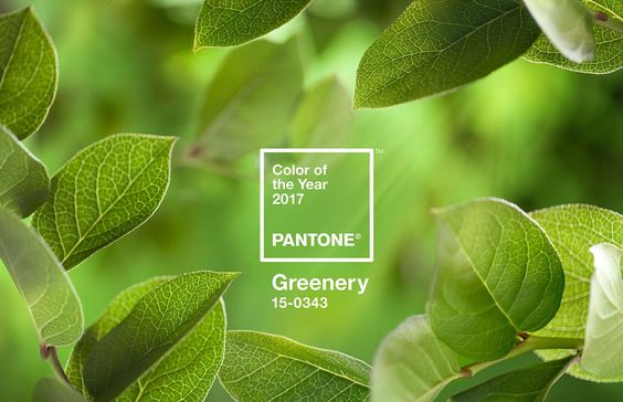
Every year, Pantone chooses a color that reflects the current cultural climate and serves as an expression of a mood and/or attitude. 2016 was the year of Rose Quartz & Serenity, the inspiration behind this duo came from the ever changing and chaotic times where consumers were seeking harmony and mindfulness which was found in these two calming pastel colors. We were happy to hear that Pantone unveiled the 2017 “Color of the Year” to be: Greenery. Greenery signifies new beginnings & growth! 2017 let’s do this!
“Greenery burst forth in 2017 to provide us with the reassurance we yearn for amid a tumultuous social and political environment. Satisfying our growing desire to rejuvenate and revitalize, Greenery symbolizes the reconnection we seek with nature, one another and a larger purpose.”
Greenery is nature’s neutral! In a world taken over by technology, Pantone has partnered with Airbnb to create an experience in nature inspired by Greenary! “There’s a growing desire to reconnect with nature and what is real, and find ways to disconnect from technology. We need a break. We need to stop and breathe.” -Laurie Pressman, Pantone Color Institutes VP. Disconnecting with the world and connecting with oneself can bring joy, peace and the ability to view life on a more positive note.
On top of it all, Pantone did our homework for us by creating a selection of 10 palettes pairing Greenery: http://bit.ly/2gE4JEE. This versatile, “trans-seasonal” shade that can be seamlessly paired with a variety of different neutrals, brights, pastels, metallic and even the two 2016 colors of the year, Rose Quartz & Serenity.
We are excited to find this zesty yellow-green shade in fashion, decor, architecture and more throughout 2017!


